How to make a website
Create a new file with the extension .html (i.e. “index.html”).
Open the file with a plain text editor (i.e. Notepad).
Insert a basic HTML structure:
<!doctype html>
<html lang="en">
  <head>
    <meta charset="utf-8" />
    <title></title>
    <meta name="viewport" content="width=device-width, initial-scale=1" />
  </head>
  <body></body>
</html>
Save the file. Then open the file in a browser. Tada, a blank website. 🙂
Adding content
Next, we add Bootstrap, a library, which comes with pre-styled components:
<!doctype html>
<html lang="en">
  <head>
    <meta charset="utf-8" />
    <title></title>
    <meta name="viewport" content="width=device-width, initial-scale=1" />
    <link
      href="https://cdn.jsdelivr.net/npm/bootstrap@5.3.2/dist/css/bootstrap.min.css"
      rel="stylesheet"
      integrity="sha384-T3c6CoIi6uLrA9TneNEoa7RxnatzjcDSCmG1MXxSR1GAsXEV/Dwwykc2MPK8M2HN"
      crossorigin="anonymous"
    />
  </head>
  <body></body>
</html>
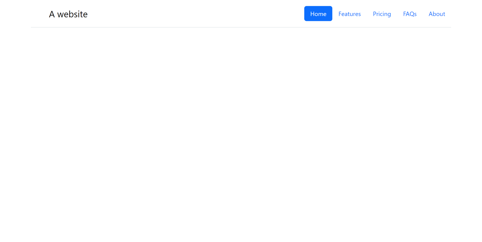
Next, we add a navigation bar:
<!doctype html>
<html lang="en">
  <head>
    <meta charset="utf-8" />
    <title></title>
    <meta name="viewport" content="width=device-width, initial-scale=1" />
    <link
      href="https://cdn.jsdelivr.net/npm/bootstrap@5.3.2/dist/css/bootstrap.min.css"
      rel="stylesheet"
      integrity="sha384-T3c6CoIi6uLrA9TneNEoa7RxnatzjcDSCmG1MXxSR1GAsXEV/Dwwykc2MPK8M2HN"
      crossorigin="anonymous"
    />
  </head>
  <body>
    <div class="container">
      <header
        class="d-flex flex-wrap justify-content-center py-3 mb-4 border-bottom"
      >
        <a
          href="/"
          class="d-flex align-items-center mb-3 mb-md-0 me-md-auto link-body-emphasis text-decoration-none"
        >
          <svg class="bi me-2" width="40" height="32">
            <use xlink:href="#bootstrap"></use>
          </svg>
          <span class="fs-4">A website</span>
        </a>

        <ul class="nav nav-pills">
          <li class="nav-item">
            <a href="#" class="nav-link active" aria-current="page">Home</a>
          </li>
          <li class="nav-item"><a href="#" class="nav-link">Features</a></li>
          <li class="nav-item"><a href="#" class="nav-link">Pricing</a></li>
          <li class="nav-item"><a href="#" class="nav-link">FAQs</a></li>
          <li class="nav-item"><a href="#" class="nav-link">About</a></li>
        </ul>
      </header>
    </div>
  </body>
</html>

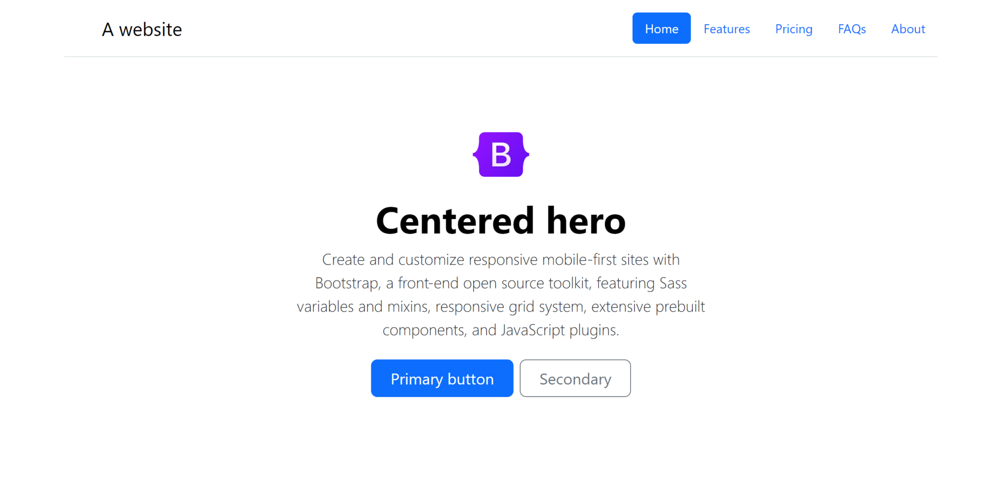
Next we add some content to the main section.
<!doctype html>
<html lang="en">
  <head>
    <meta charset="utf-8" />
    <title></title>
    <meta name="viewport" content="width=device-width, initial-scale=1" />
    <link
      href="https://cdn.jsdelivr.net/npm/bootstrap@5.3.2/dist/css/bootstrap.min.css"
      rel="stylesheet"
      integrity="sha384-T3c6CoIi6uLrA9TneNEoa7RxnatzjcDSCmG1MXxSR1GAsXEV/Dwwykc2MPK8M2HN"
      crossorigin="anonymous"
    />
  </head>
  <body>
    <div class="container">
      <header
        class="d-flex flex-wrap justify-content-center py-3 mb-4 border-bottom"
      >
        <a
          href="/"
          class="d-flex align-items-center mb-3 mb-md-0 me-md-auto link-body-emphasis text-decoration-none"
        >
          <svg class="bi me-2" width="40" height="32">
            <use xlink:href="#bootstrap"></use>
          </svg>
          <span class="fs-4">A website</span>
        </a>

        <ul class="nav nav-pills">
          <li class="nav-item">
            <a href="#" class="nav-link active" aria-current="page">Home</a>
          </li>
          <li class="nav-item"><a href="#" class="nav-link">Features</a></li>
          <li class="nav-item"><a href="#" class="nav-link">Pricing</a></li>
          <li class="nav-item"><a href="#" class="nav-link">FAQs</a></li>
          <li class="nav-item"><a href="#" class="nav-link">About</a></li>
        </ul>
      </header>

      <main>
        <div class="px-4 py-5 my-5 text-center">
          <img
            class="d-block mx-auto mb-4"
            src="https://getbootstrap.com/docs/5.3/assets/brand/bootstrap-logo.svg"
            alt=""
            width="72"
            height="57"
          />
          <h1 class="display-5 fw-bold text-body-emphasis">Centered hero</h1>
          <div class="col-lg-6 mx-auto">
            <p class="lead mb-4">
              Create and customize responsive mobile-first sites with Bootstrap,
              a front-end open source toolkit, featuring Sass variables and
              mixins, responsive grid system, extensive prebuilt components, and
              JavaScript plugins.
            </p>
            <div class="d-grid gap-2 d-sm-flex justify-content-sm-center">
              <button type="button" class="btn btn-primary btn-lg px-4 gap-3">
                Primary button
              </button>
              <button
                type="button"
                class="btn btn-outline-secondary btn-lg px-4"
              >
                Secondary
              </button>
            </div>
          </div>
        </div>
      </main>
    </div>
  </body>
</html>

On the website of bootstrap snippets for different components can be found under “Examples” and “Docs”. Those can be copied over into the HTML document.
For more details about how certain things work in HTML, CSS or JavaScript, you can usually find good information on MDN. I usually search for “mdn <topic>” (i.e. “mdn html head”) in Google to find the relevant MDN page or pages.
For multiple websites, you can just create HTML files with different names. You can also put them into subfolders to create a path (i.e. https:/example.com/about/ would refer to about/index.html.
Hosting the website
To start with I can recommend Google Firebase Hosting.
I hope this information gets you started. Best of success in your further journey.
License of the code snippets in this article
All code snippets are provided under the MIT-0 license.